
Case Study: UX Design, Art Direction, Visual Design
Men’s Wearhouse: Millenial dilemma
Project Brief
Men’s Wearhouse (MW) has been around for 40+ years. It would almost feel “un-american” if you hadn’t experienced renting a Tuxedo from them. But in 2018, MW’s big marketing problem was to “combat the negative perception among Millenial and Gen Z audiences that Men’s Wearhouse is an outdated brand.” This, coupled with an overwhelming sentiment of dissatisfaction of the site experience from both users and internal stakeholders, led to the desire for a website redesign.
As Art Director, my role was to lead the effort in redesigning the website to appeal to a new “millennial” customer. Success would be measured in achieving the provided KPI goals in comparison to the year prior:
Increase coupon registrations
Increase site visitors to lead conversion rate
Increase event creations
Research
Bridal Personas

Brides: Millennial, multicultural. The primary driver of the wedding planning. She knows exactly what she wants for her wedding. It’s important that her groom and his guys look good and is very involved in his attire decision.

Grooms: Millennial, multicultural. He is much more involved in the wedding planning process than ever before. He wants to stand out, look his best, and get the best value from his purchase.
Prom Personas

Teens: They value individuality and self-expression and are also the most accepting generation of other people’s uniqueness.

Parents: They expect quality from a suit rental or purchase, and breadth of options. They want their kid to look good, but don’t want to spend a lot of money.
Competitive Analysis
National Competitors: Men’s Wearhouse’s biggest online competitors are fairly new to the industry, and represent the needs of a younger, internet-reliant generation that may be disinterested in renting from a place where their Dads shop.
Key comparisons:
Their website interfaces are minimal and modern (a stark contrast to MW).
Their marketing is focused on the convenience of their online service.

The Black Tux: Online tuxedo rental. Available to try on in-store at select Nordstrom locations.
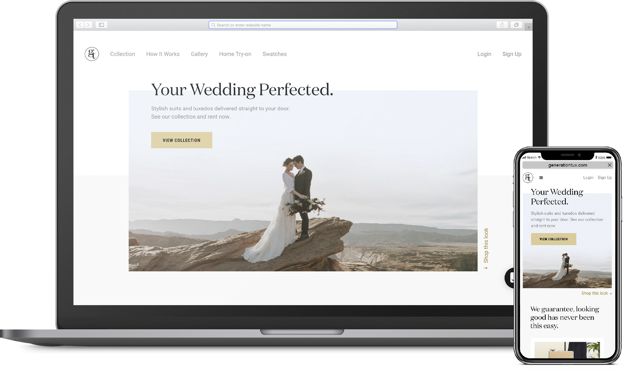
Generation Tux: Company started by former owner of Men’s Wearhouse, George Zimmer. Online only suit and tux rentals.
Local Competitors: Although MW is the biggest fish in the pond, all local franchises combined make-up the largest competitor overall.
Key comparisons:
They rely on undercutting MW’s prices to gain an advantage.
Some of their site experiences felt more clean and modern than MW’s.

Friar Tux: Franchise covering mainly Southern California. Rentals available online or in-store.

Savvi Formalwear: Franchise covering mainly the north midwest. Rentals are available in-store only.
Opportunity
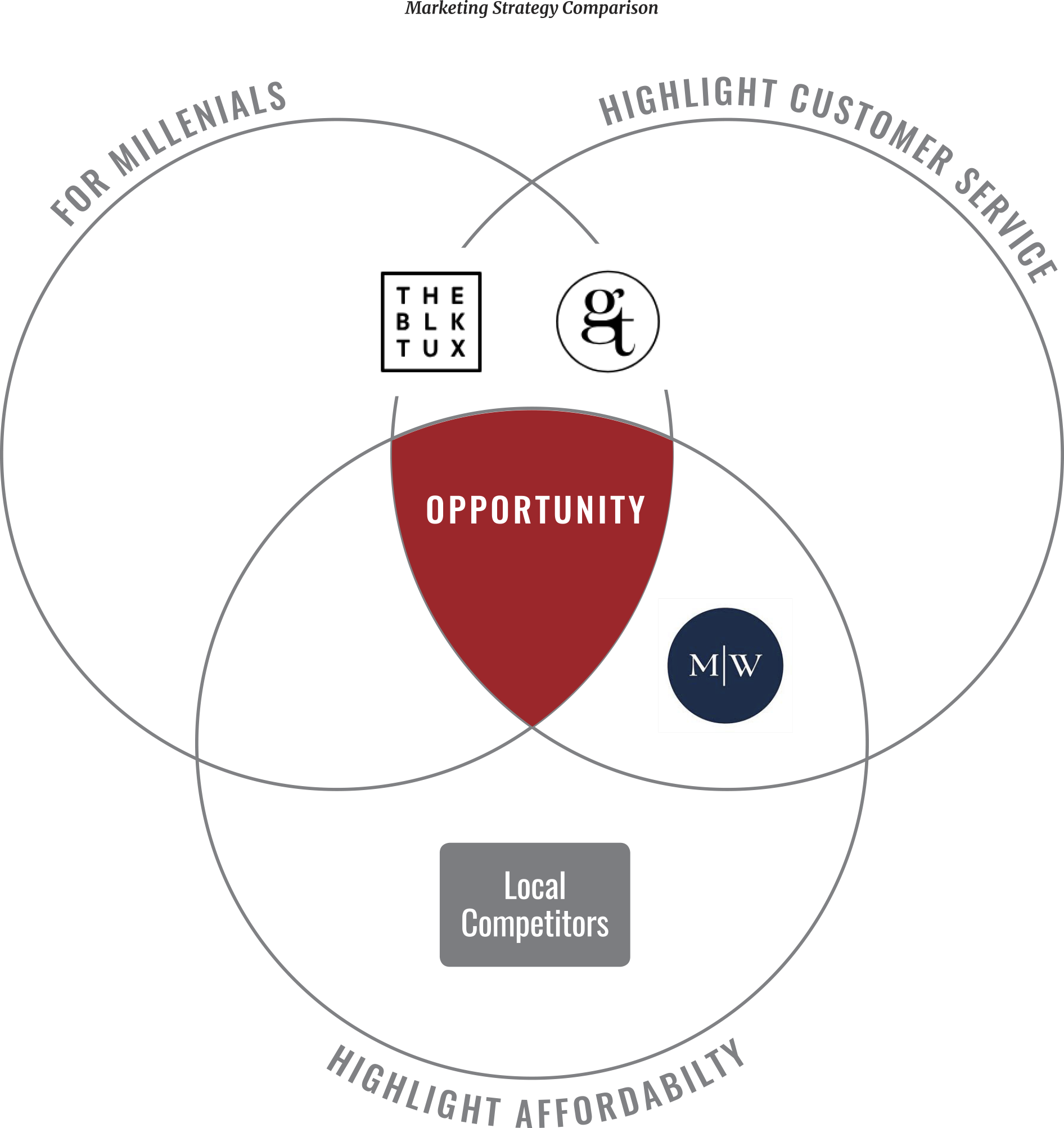
Men’s Wearhouse already has the best value and customer service, but Millennials just don’t believe it’s a store for them. Although it is only one facet of MW’s brand experience, the website is a significant portal to brand messaging.
So how might we create a website which appeals to a Millennial audience? After considering business requirements, customer data, and input from creative, we believe that creating a visual solution that is simple and up to current design standards would help accommodate millennial tastes and attention spans.
Design Approach
Visual Hierarchy
In doing a site audit of the homepage I’ve concluded that the biggest problem the site is dealing with is visual hierarchy. The overall contrast between image size and copy isn’t enough to create a clear visual path for users to follow. I proposed the following hierarchy to remedy this:
1. Photography: Photoshoots cost $500K+ at times and customers want to see product detail and be immersed in the images’ story. Increasing image sizes will facilitate this, as well as reflect a better return on the company’s investment.
2. Promotional Pricing: Increasing the size of promotional pricing would allow a quicker read for users.

Information hierarchy
Module Architecture: Currently, customer service modules are interspersed in-between e-com modules. This fragmented experience can slow down the customers path to conversion.
Since selling is the highest priority for the business, and customers want a competitive price, grouping e-comm modules at the top encourages conversion early.
Service modules reinforcing brand value are considered secondary and should be moved to the bottom where users can further explore reasons to purchase from MW.
Less Copy: Parsing down copy for mobile will help the content “breathe”, and keeps the read short to accommodate for diminishing attention spans (about 8 seconds).

A Simple Design system
Because of quick development time requirements, the site team had adopted a new CMS in order to gain some efficiency. To help us easily acclimate to CMS restrictions, I introduced MW’s first Design System to use for this redesign. This also ensures design consistency across multiple pages, and sets expectations early with channel partners to help avoid last minute change requests and unexpected reactions.


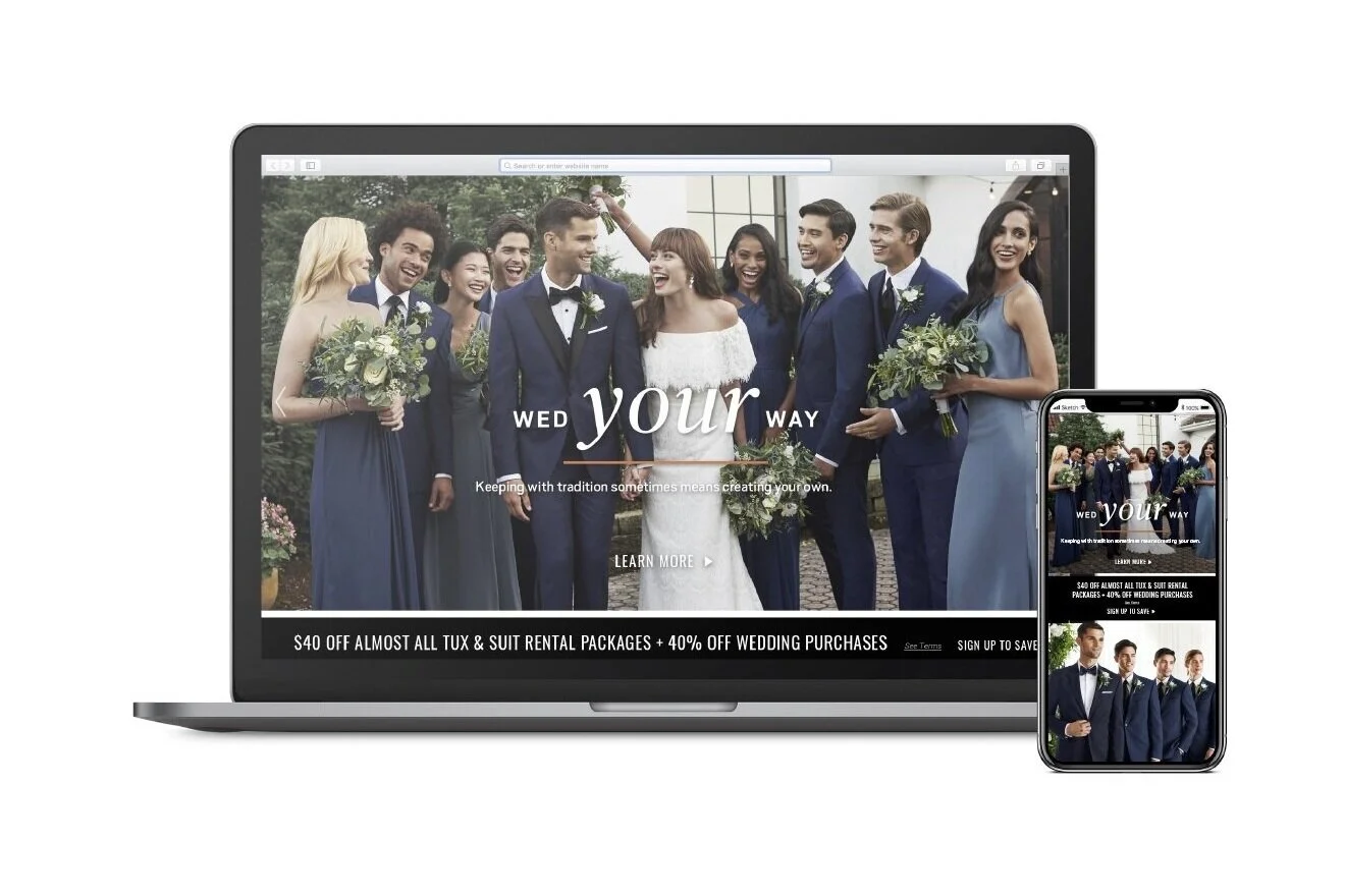
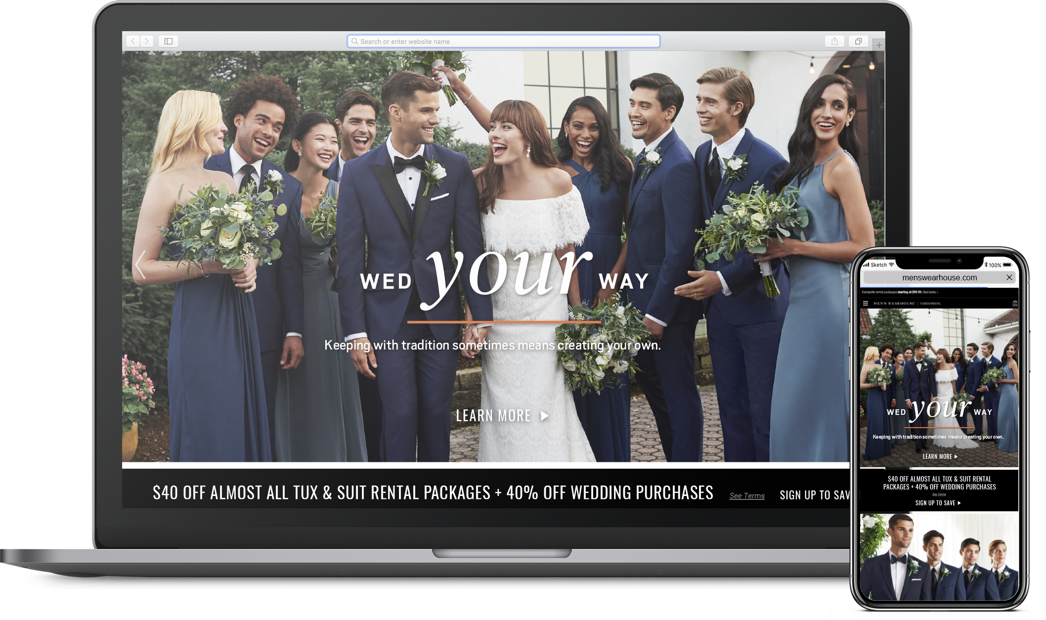
Final Screens
DESIGN COMPARISON - DESKTOP


Design comparison - Mobile


Performance
“By implementing a more modern and visually striking look and feel to our special occasion websites through new campaign imagery that reflected our core audiences demographically, compelling storytelling and promotional messaging, and an overall more seamless user experience, we saw double-digit increases within the first quarter of launch in key site metrics...”
- Angelique Marquez-Salamone, Marketing Director, Tailored Brands
First Quarter KPI results for 2019 vs. 2018:
Coupon registrations: +13%
41,064 vs. 36,234
Site visitors: +11%
2,635,592 vs. 2,381,364
Event Creations: +33%
50,794 vs. 36,234
Demand (product in shopping carts): +52%
$789,123 vs. $520,814
Next Steps
Unfortunately I have left the Men’s Wearhouse, but I am still in contact with some friends that still work there, and am hoping to receive updated performance data in the future. If I were to propose any ways to improve the experience here are a few things I would want to explore:
Expand the design system by creating modules which accommodate even more types of unique content.
Facilitate a usability test for mobile in order to illustrate to the business that trying to accommodate for every business request can be detrimental in a mobile experience.